

WELCOME TO OUR VISUAL IDENTITY
Introduction
Our visual identity is the face of our brand. It presents our personality, our attitude and our values to the outside world - and it is one of the key assets that unites us across our global group.
This sub-site presents the core elements of our visual identity; an identity created to represent our Carlsberg heritage while being modern, dynamic and bold.
Please find inspiration on this site - its simple guidelines and best practice examples on how to use the different building blocks of our visual identity - when creating any Carlsberg Group expression.
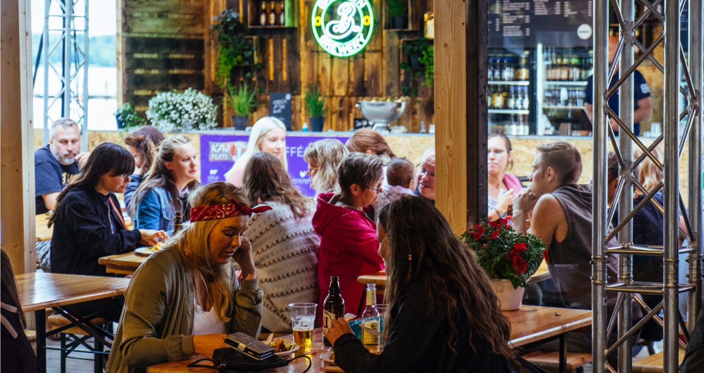
Every piece of Carlsberg Group design contributes to our brand appearance - let's look sharp and coherent!
Our Group branding is now updated to support colleagues that might experience color-blindness, as well as
supporting better performance on non-printed, digital products.
Our Group Corporate Visual Identity (CVI) introduced in 2017, has been serving us well over the years, but
was mainly limited to be used on presentations or print.
Our Group branding is now designed for better performance on non-printed digital products and with a
strong focus on accessibility, in consideration of colleagues that for example might experience colorblindness.
What is new
- Support colors are now more inclusive
- More clear guidelines and rules around Carlsberg Group logo usage
- Introducing Monterrat as a fall-back font to ensure readibility in any case
Our logo
Our iconic logo was introduced in 1904 designed by the Danish architect Thorvald Bindesbøll.
Our Carlsberg Group logo is available in two primary colours, namely the Carlsberg green and white.
UPDATE! Our logo rules are now updated for clearer guidelines and understanding
Placement
Fixed placement
The padding around the logo is defined by the width of the Carlsberg 'C'. This rule regarding padding should always be respected when working with layouts.
Free placement
As an alternative to the fixed placement you can do a free placement of the Carlsberg Group logo. A rule of thumb is to down-scale the logo by 50% to 80% from CAPS-height and to centre it somewhere suitable in relation to the typography, considering the overall balance of the layout.

OUR TYPOGRAPHY
Carlsberg Sans
Carlsberg Sans Light

Carlsberg Sans Light Italic

Carlsberg Sans Bold

Carlsberg Sans Bold Italic

Carlsberg Sans Black

Carlsberg Sans Black Italic

Layout principles
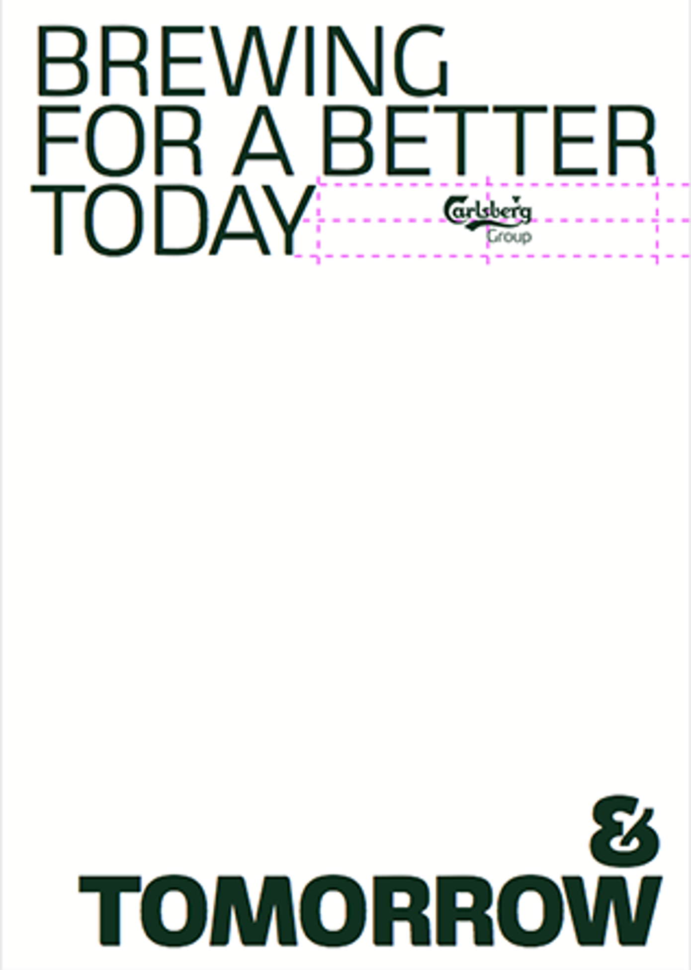
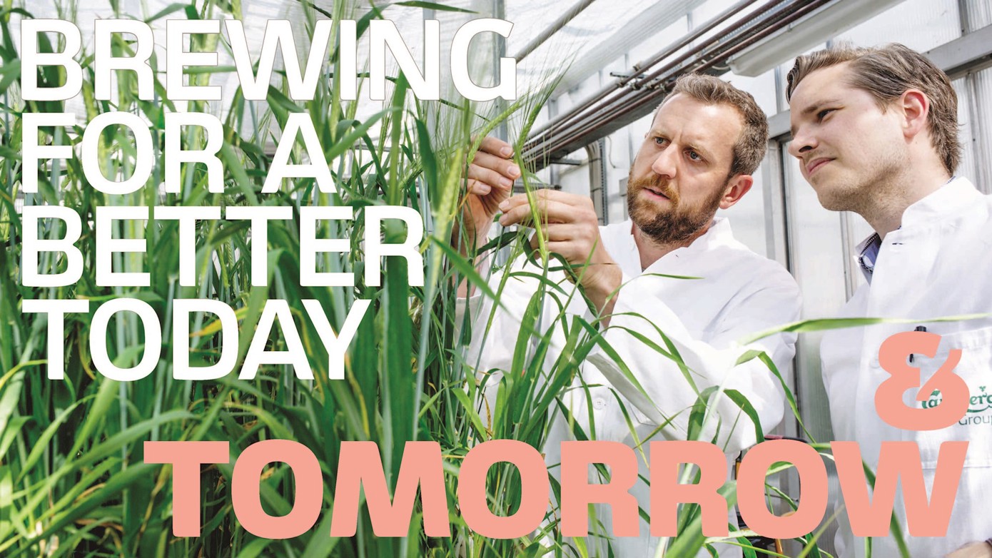
When working with displays, text and headlines, we use our Carlsberg Sans typography in a flexible and bold way, playing around with it to gain a vibrant and modern expression. Using a combination of different Carlsberg Sans weights furthermore contributes to give the layout a vibrant and bold expression.
Headlines and display text should always be written in ALL CAPS, and never in lowercase letters.

OUR COLOURS
Inspired by our global brands
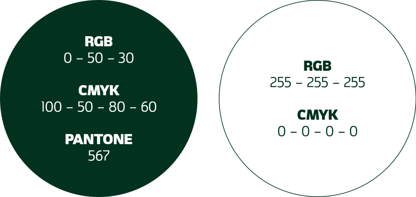
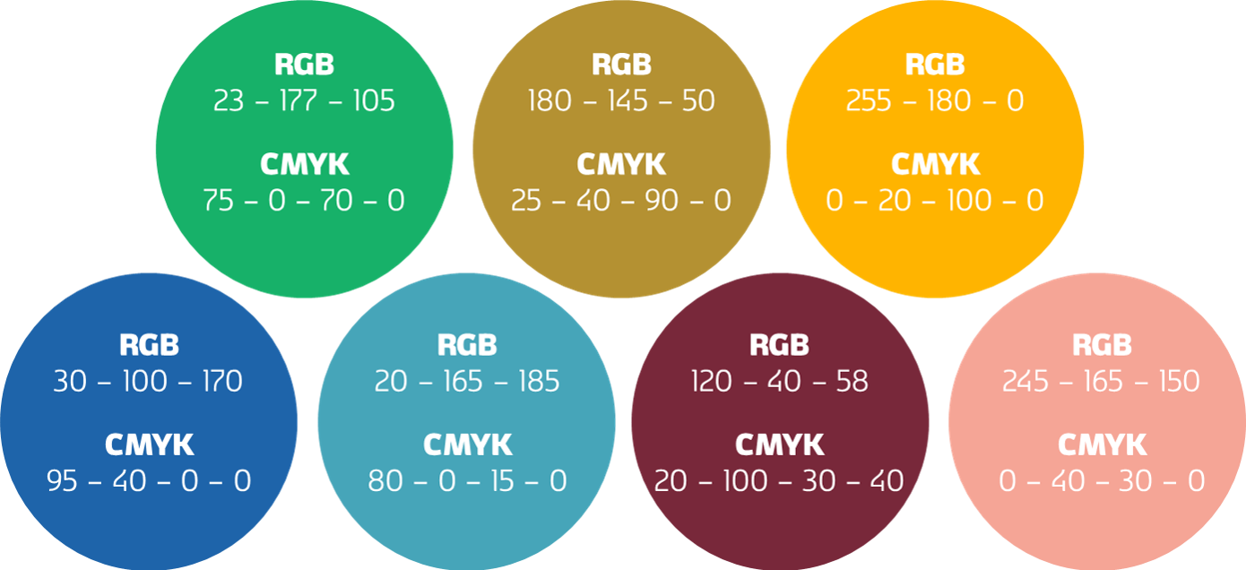
Primary colours
Our primary colours consist of a deep, elegant ‘Carlsberg green’, complemented by a clean white.
Secondary colours
Inspired by all the Carlsberg Group brands and bottles, our secondary colours contribute to a modern and vibrant visual expression, reflecting the scale and diversity across our companies and brands.
The combination within a layout should always include one or both primary colours, combined with only one secondary colour.

OUR KEY VISUAL
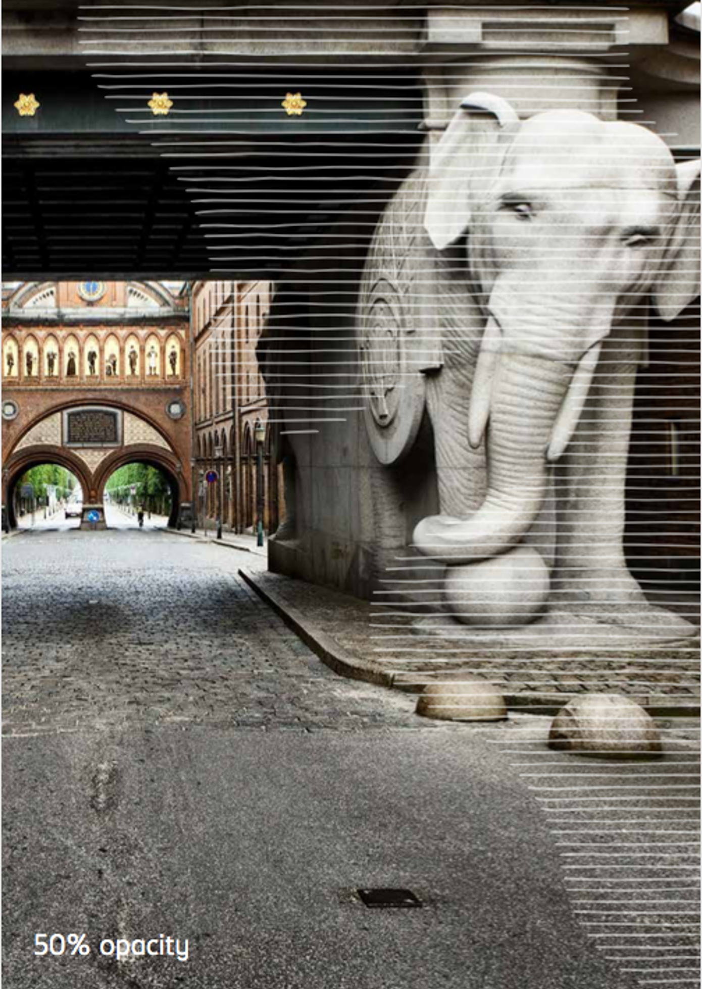
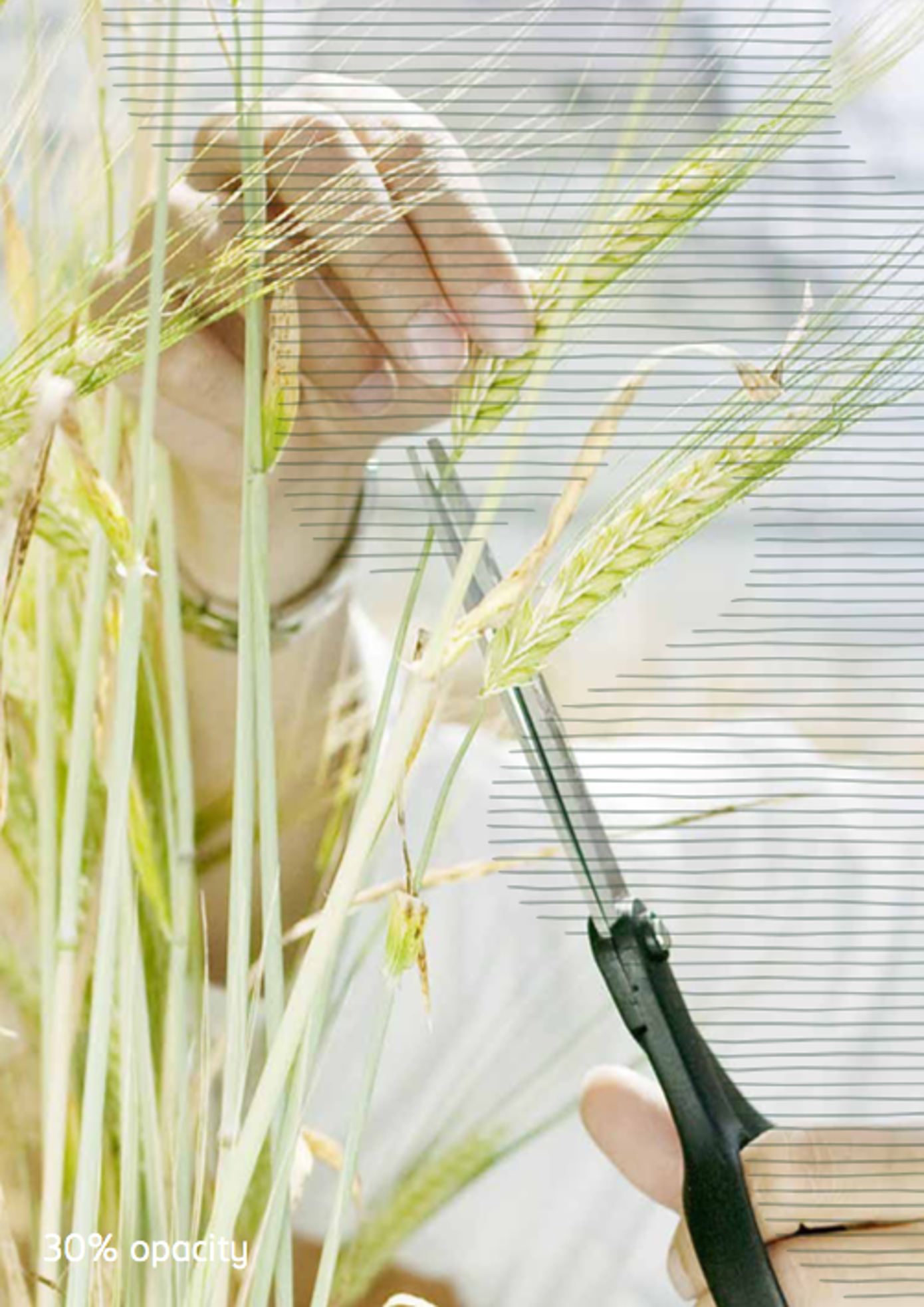
Hand crafted hop leaf

Our prominent graphic element is an interpretation of our iconic hops leaf mark – inspired by the fine crafted lines of our heritage labels.
The hops leaf is hand crafted with fine delicate lines that link it to our heritage bottles and give it a light texture and a human character. The crafted hops leaf comes in two sizes, which we use dynamically in different crops and colours.
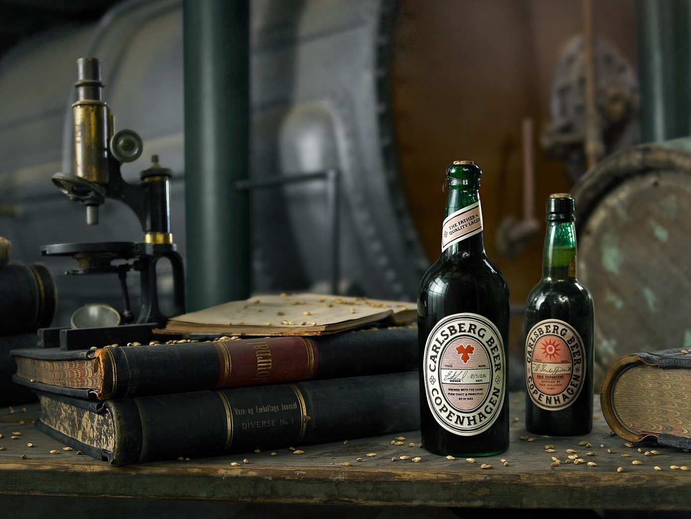
The crafted hops leaf comes in our two primary colours, Carlsberg green and white, and in our seven secondary colours. The white hops leaf is used on all coloured backgrounds, whereas the Carlsberg green and the secondary coloured hops leaves are used on white backgrounds.
The hops leaf is meant to have a subtle, tone in tone expression and is therefore toned down in opacity.
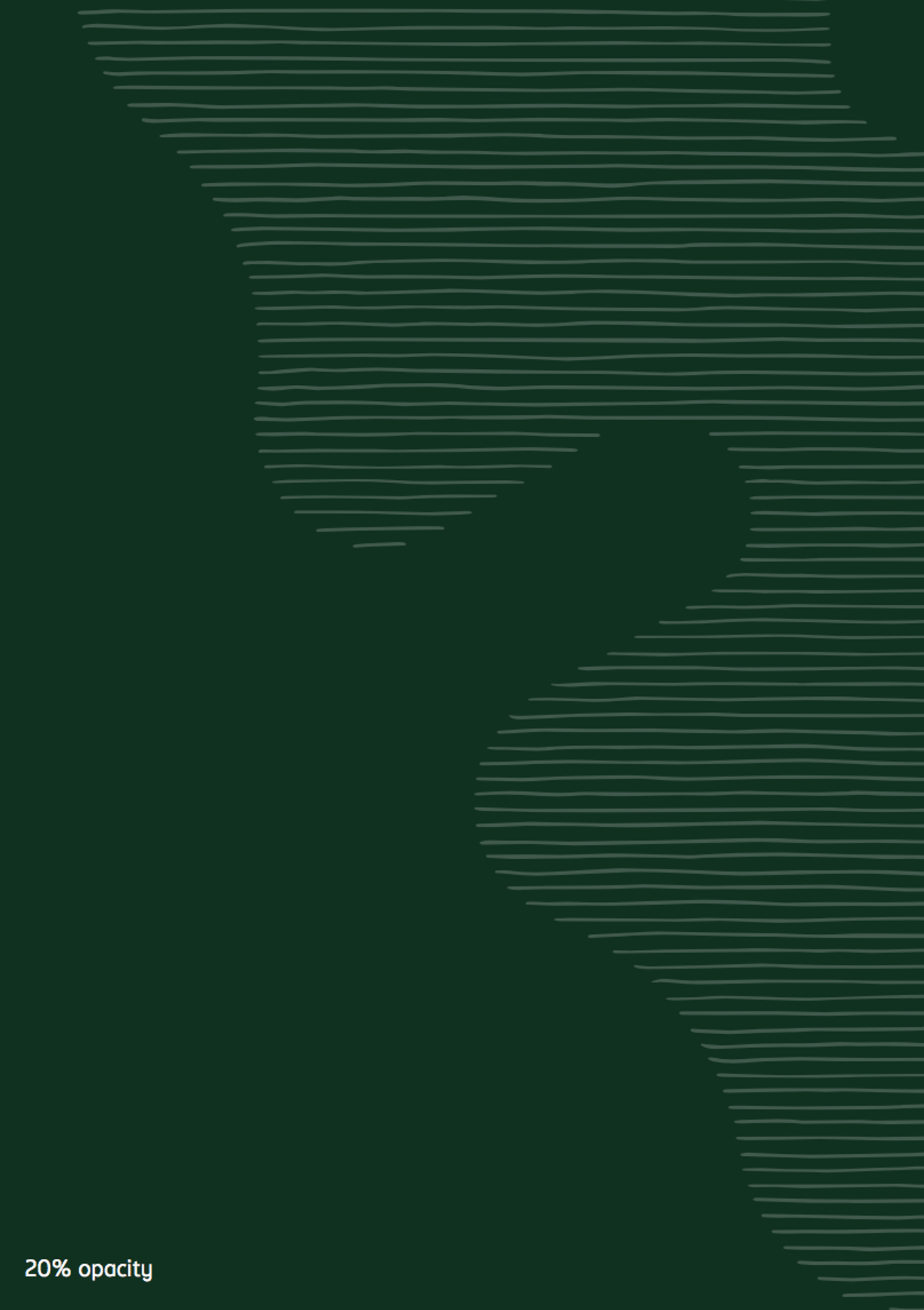
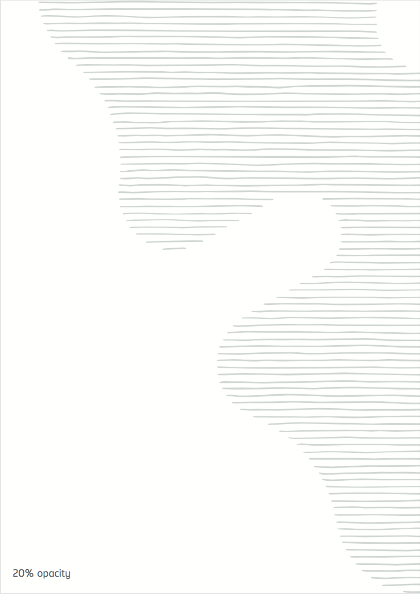
For image backgrounds we use our white and Carlsberg green hops leaf.

Central & Eastern Europe and India
-
Azerbaijan
-
Belarus
-
Bulgaria
-
Canada
-
Croatia
-
Estonia
-
Greece
-
Hungary
-
India
-
Italy
-
Kazakhstan
-
Latvia
-
Lithuania
-
Serbia
-
Ukraine